The Hidden Geometry in Global Spreading Phenomena
We live in a globally connected world. Billions of passengers travel each year on the worldwide air-transportation network and cover trillions of miles. There is no scale to modern mobility. Our global connectivity has reshaped the way that spreading phenomena evolve on the networks that connect us. The complexity of modern mobility translates into a high degree of spatio-temporal complexity of spreading phenomena such as the spread of news, the dynamics of global diseases of human mediated bio-invasion.
Understanding complex spreading phenomena, for example the H1N1 pandemic in 2009 or the global spread of SARS in 2003, at a fundamental level three questions require answers:
1.) When is an the epidemic going to arrive at a given location?
2.) How fast is it moving?
3.) Where did it originate?
In simple contagion phenomena these questions are typically easy to answer because many of them exhibit a dynamics that yields concentric propagating wave. This is no longer the case when contagion phenomena evolve on highly connected networks. The clip below is a simulation of a hypothetical epidemic, similar in characteristics to the 2009 swine flu pandemic, on the worldwide air transportation network (approx. 4000 nodes and 2500 links) with a hypothetical outbreak in Mexico. A qualitative characteristic is that the pattern very quickly becomes irregular, no apparent wavefront exists and it is very difficult to predict arrival times at chosen nodes at the network. Also, given a snapshot of the spread it’s nearly impossible to reconstruct the origin of the spread.
Global Spreading Phenomena. The clip depicts the
dynamics of a hypothetical emergent disease and pandemic
with original outbreak in Mexico.
One of they questions we tried addressing in this project is whether all these dynamic phenomena that evolve on networks are governed by some fundamental principle that is masked by the apparent complexity of the network. The key idea of the project is that geographic distance in a globally connected world is no longer a good indicator of how “far” locations are effectively separated from one another. For example more people travel each day between London and New York than e.g. London and some small town in the UK. So would it not make sense to think of London and New York as being close neighbors and London and a small town in the UK be far apart?
It turns out that based on this principle we can define an effective distance related to the traffic that connects places for every pair of nodes in the network. This way we extract all nodes from their geographic embedding and represent them based on effective distance. The figure below Illustrates how far every node in the network is separated from Mexico, for example. The radial distance in this figure is proportional to the effective distance from MEX. The tree structure in this representation is the most probable path that a spreading phenomena will take if initiated there.
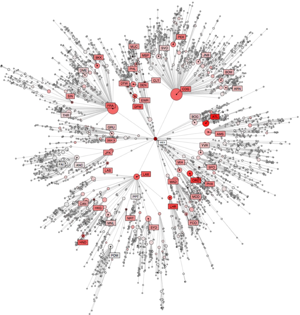
Effective distance and shortest paths. From the
perspective of a reference node (MEX) the radial distance
is the effective distance from the reference node, the
tree represents the expected spreading path a contagion
phenomenon will take.
When the world is mapped according to this node specific perspective, patterns of spread that are complex in the conventional view, become simple wave like propagations in the new perspective. See For instance the video clip below. The clips shows exactly the same dynamics as the previous clip, only displayed in a different way. In this view then it becomes possible to define epidemic speeds and predict epidemic arrival times.
The spreading dynamics in effective distance
perspective. The central node is MEX and the clip
depicts the same simulation as in the conventional view
above. In the new view everything is concentric and
simple.