The Eyjafjallajökull Event:
What complex network theory can say
The eruption of the
Icelandic subglacial volcano Eyjafjallajökull in April 2010
threw a massive cloud of volcanic ash into the atmosphere,
and its subsequent dispersal blocked all air traffic in
many major European airports such as Heathrow, Charles de
Gaulle, and Frankfurt. In all more than 20 of the largest
European airports were completely shut down for a period of
several days.
Under normal conditions these airports serve some 1.5 million passengers in total every day, and passengers travel to more than 1,000 international airports worldwide. The complete shutdown of these airports thus represents a significant impact on international traffic: thousands of travelers are stranded at airports or unable to travel, and the economic impact on the affected airlines alone is around $200–250 million each day the airports remain inoperative. The consequences of the ash cloud are also not localized. Like many other technological or biological systems, the global aviation grid is a large and complex network in which even small changes may lead to unexpected consequences for the network as a whole, and indeed airports around the entire world are significantly affected by the shutdown of the European centers.
The conventional method for investigating the behavior of a network subject to vertex removal is percolation theory. This approach focuses on determining the number of nodes that must be removed, through a targeted attack or random failure, to split the network apart into small components. However, in a highly-connected network such as the global aviation network, even a removal algorithm that targets the most important nodes must remove about 20% before the network breaks down, equivalent to removing more than 80% of the total traffic (see Fig. S2 at the right).
Although the eruption of Eyjafjallajökull has had a major impact on air traffic, it has not brought the network close to the percolation threshold (shutting down 27 major European airports affected by the ash cloud on April 16, 2010 removes roughly 18% of the world-wide traffic). Nonetheless, current events have crippled certain parts of the aviation network, and by employing novel techniques that take into account the varying strengths of connections and local structure, we are investigating the impact on the aviation system from a local perspective to gain a more detailed picture of how the network structure changes.
Airport closings cause changes in effective inter-regional distances
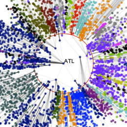
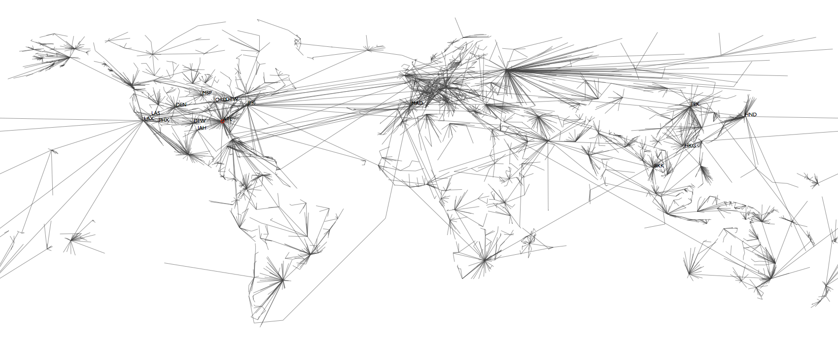
The core of our method is the calculation of shortest paths in the network. When you use Google Maps to get directions, it does not (necessarily) give you the shortest route in terms of physical distance. Instead, it tries to find a route that will take the least amount of time; in this sense, two cities connected by a highway can be “closer” together than two villages connected by only a small road, even though both the cities and the villages are equally distant in geographical terms.Similarly, in the aviation network we are not interested in the geographically shortest path. Instead, we say that two airports are “close” when they have many passengers traveling between them, and "distant" if they exchange few passengers. Thus, this distance measures an effective interaction between two airports (or the populations they serve). One way to visualize this is to pick a reference airport and lay out all remaining airports radially around the central one. The distance from the central airport, however, corresponds to the shortest-path distance and not physical distance.
Figure 1a shows such a structured tree view of the network from Atlanta International Airport. The lines indicate the branches of the so-called shortest-path tree that gives an impression of the structure of the whole network as seen from the airport in the center, and the colors of the airports indicate geographical divisions; all airports in North America, for example, are dark-blue.
Note how the large red circle marks the approximate distance of the world from Atlanta – only a few large international hubs like Frankfurt (FRA), London (LHR) or Hong Kong (HKG) lie inside the circle while the majority of airports are outside. The only exception, not too surprising, are the many North American airports. Thus, the U.S. is “close” to Atlanta, while the rest of the world is further, but equally far away.
Things change if we take out 27 major European airports (move the mouse over Fig. 1a). The picture appears to be less compact, indicating that the distance of many parts of the world to Atlanta has increased. Indeed, all West-European airports (purple) are now clearly outside the circle. But also Africa (red, green, yellow), India (cyan) and the Middle East (dark-purple) are being pushed away.
Furthermore, we can see structural changes: Normally, the Chicago (ORD) branch contains almost all of Western Europe, and in that the large London (LHR) branch hosts Africa, India and the Middle East. Since London is closed, Western Europe is now split into three parts behind New York (JFK), Chicago, and Miami. Africa, India and the Middle East are now largely in the Asian branches, behind Honk Kong and Bangkok (BKK).
Similar observations can be made for many other airports. To measure these changes quantitatively, we can compute the relative increases in shortest-path lengths caused by the closure of the 27 airports. The top panel of Figure 2 shows this for five selected airports, gathered by geographic region. For example, the leftmost bar indicates that the median of the relative increases of all the shortest paths beginning at Atlanta and terminating in Central Asia is about 35%. The bottom panel generalizes this to compare entire regions against one another.
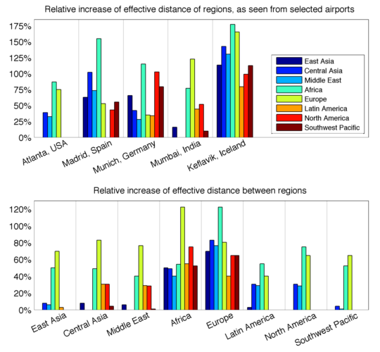
Figure 2: Relative increase of effective distances
in the network
Other interesting case studies are the German airport Munich (MUC) and Iceland's international airport Keflavik (KEF). Here, the world drifts away more homogeneously with the closure of airports. This indicates that both airports strongly rely on these now-closed hubs to reach any part of the world. Contrary to Keflavik though, Munich's distance to Europe increases less than the rest of the world, meaning that while dependent on hubs for global destinations, it is well-connected locally within Europe.
Shortest-path-tree analysis reveals and quantifies
the effect of airport closures on global traffic

In addition to measuring the relative change in path lengths, it's also possible to make a direct comparison of the shortest-path tree of an airport before and after the eruption, that is, to directly compare the structure of the two trees of Fig. 1a or 1b. Every airport in the world experiences some small effect: if you want to fly to London, well, now you can't. Some airports, however, see little change beyond the local shutdowns – you can no longer fly to areas of Europe, but the shortest paths to all other locations remain unchanged. These airports receive a difference score of (nearly) 0. On the other hand, airports that rely on a single strong connection to a regional hub to serve large areas experience massive changes in their shortest-path tree if that hub closes, and the airports that experience the strongest effect are assigned a difference score of 1. The table below lists the 20 airports in the world that serve the largest number of passengers daily in our data, and orders them according to how much their shortest-path tree is affected by the closing of airports in Europe. Many airports are more severely affected than the ones in this table; here we only look at high-traffic airports. As you can see, many of the world's largest airports are significantly affected by the events in Europe, despite being geographically distant. In particular Singapore, Hong Kong, and Beijing are all strongly affected, despite being separated from Iceland by continents.
| Code | Name | Country | Difference Score |
|---|---|---|---|
| MAD | Madrid Barajas Apt | Spain | 0.730 |
| SIN | Singapore Changi Apt | Singapore | 0.423 |
| JFK | New York J F Kennedy International Apt | USA | 0.231 |
| HKG | Hong Kong International Apt | Hong Kong | 0.167 |
| PEK | Beijing Capital Apt | China | 0.167 |
| BKK | Bangkok Suvarnabhumi International Apt | Thailand | 0.128 |
| DTW | Detroit Wayne County | USA | 0.115 |
| ORD | Chicago O'Hare International Apt | USA | 0.115 |
| PHL | Philadelphia International Apt | USA | 0.115 |
| HND | Tokyo Haneda Apt | Japan | 0.103 |
| EWR | Newark Liberty International Apt | USA | 0.090 |
| IAH | Houston George Bush Intercontinental Apt | USA | 0.077 |
| DEN | Denver Intl Apt | USA | 0.038 |
| DFW | Dallas/Fort Worth Intl Apt | USA | 0.038 |
| LAS | Las Vegas McCarran International Apt | USA | 0.038 |
| LAX | Los Angeles International Apt | USA | 0.038 |
| PHX | Phoenix Sky Harbor Intl Apt. | USA | 0.038 |
| SFO | San Francisco International Apt | USA | 0.038 |
| ATL | Atlanta Hartsfield-Jackson Intl Apt | USA | 0.026 |
| NRT | Tokyo Narita Apt | Japan | 0.026 |
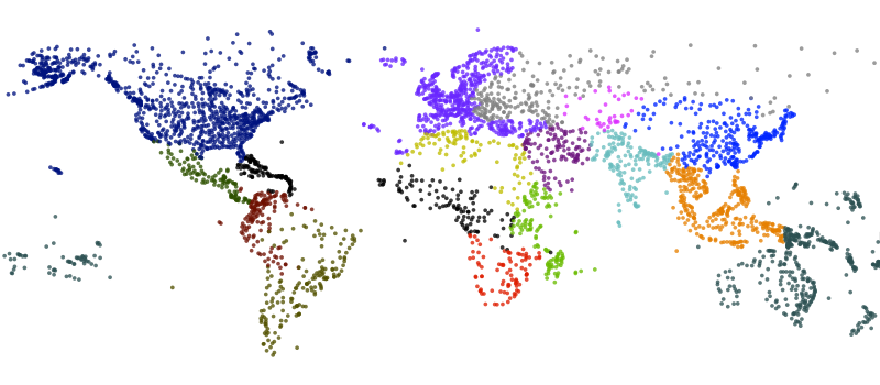
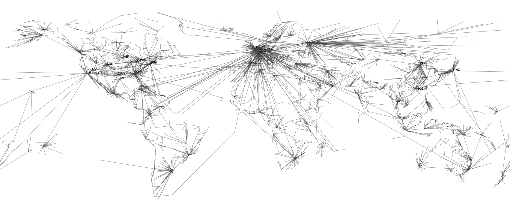
Figure S1: Airports and Regions
This map (click to enlarge) shows the locations of
all 4,069 airports in our dataset. Of all possible pairs
25,453 (0.3%) are connected by scheduled flights. The
average airport is connected with 13 other airports,
however, many airports are only connected to fewer
airports while a few hubs are strongly connected. The
best connected airport is Frankfurt (Germany) with
scheduled flights from or to 345 different airports.
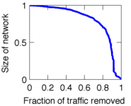
Figure S2: Fraction of nodes still connected in
the largest component after removing increasing amounts
of the total air traffic.
On a different page, we have collected all case studies in larger resolution.


Team
From left to right, top: Olivia
Woolley Meza, Christian Thiemann, Daniel Grady, Dirk
Brockmann. Bottom: Vincent David, Alejandro
Morales Gallardo, Rafael Brune.
Supported by
![]()
![]()
Aviation data provided by OAG Worldwide Ltd.